
I read a lot of papers to keep up to date on topics I’m interested in and find new ideas for projects. Often, after reading a bunch in the same subfield, I’ll find that many of them reference some of the same articles, which are probably “foundational” papers that you can’t not reference in that area. If you’re learning about an area, those are probably good ones to know about.
So I wanted to visualize this for fun! but it also has the possible benefit of giving some insights. To do this, I scraped arXiv, parsed references, created a graph, and then made it interactive with d3.js.
Try it out here if you don’t want to read about it!
There are lots of ways of doing this, but I did it in a quick and dirty way. Here’s a brief overview. arXiv is of course free, and they do support you downloading papers/sources/etc, but they also don’t want you spamming them to a ridiculous extent. I’d much rather use Google Scholar, but as of this date, they’re actually very against this type of thing. This article talks about a grad student’s summer project being about getting data from Google Scholar, but it seems like he had to just solve lots of CAPTCHAs anyway! The reason I’ve heard for them being cagey is that they probably have some deal with journals that don’t want their data aggregated.
So I’m just crawling arXiv here. To start, you give it the URL of an arXiv article, which it adds to a simple FIFO queue. It then does this process:
- Fetch the article
- Parse it to get its references
- Add each of those references to the queue
- Pop the next entry off the queue and repeat
I depth limit this, because otherwise it would certainly never end. Even with a depth of ~3, the graph already gets pretty huge!
Graph layout
Graph layouts themselves are a big topic. The layout is, well, how you display the graph. A graph is typically defined by a set of nodes and edges, with various properties depending on the type of graph (weighted vs unweighted, directed vs not, etc), but the layout is often orthogonal to those properties. That is, you can display the same graph in many ways, depending on the application.
Luckily, networkx has a bunch of layouts built in. I experimented with a few, but ultimately found the “dot” layout to be my favorite. Here are a few I tested:
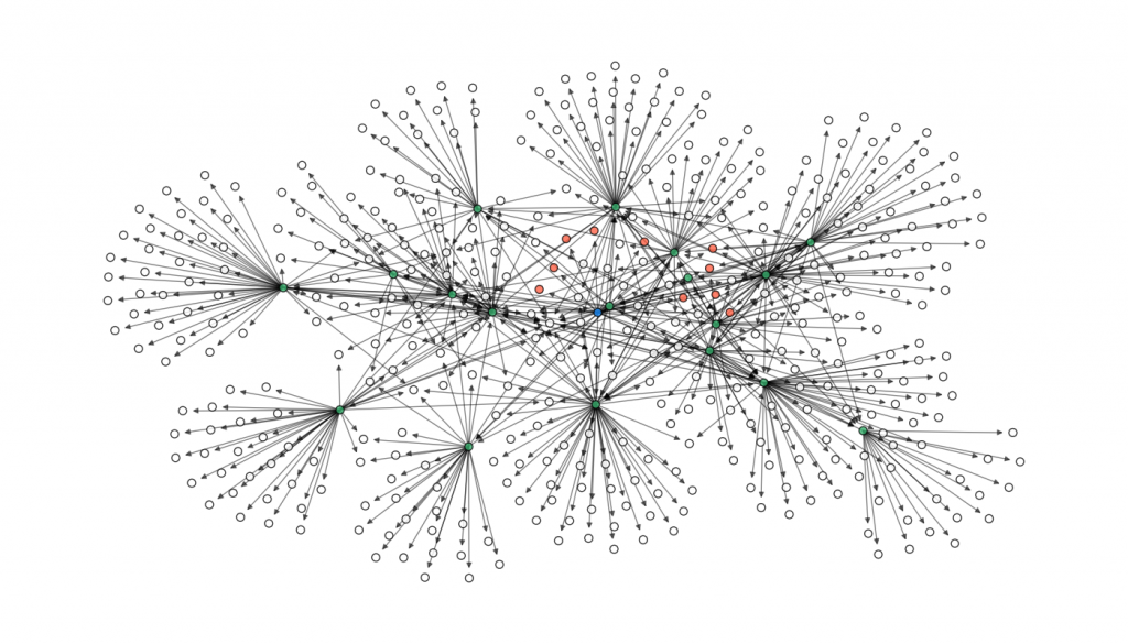
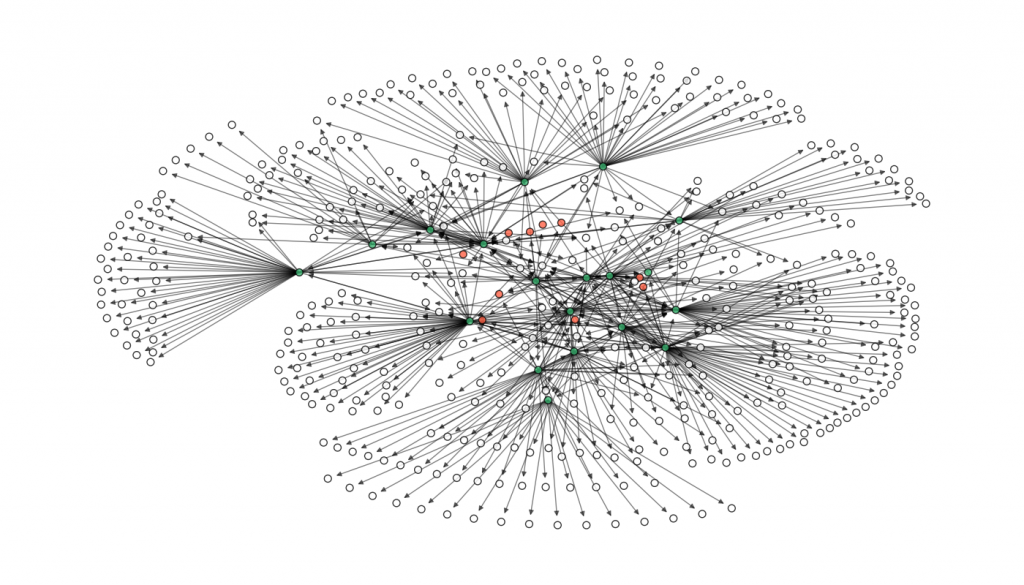
I like dot because it tightly bunches citations of the same parent together, and you can see “levels” in it fairly well.
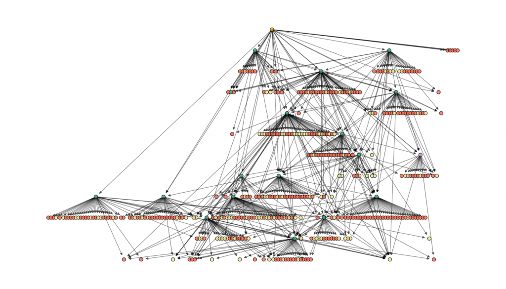
Node colors
I added colors to the nodes to make it clear what’s going on when it built the graph. Beige is just the default for a leaf node that didn’t get expanded (because it was already at the max depth). Green means it was successfully expanded. Purple means it was expanded, but using a less reliable parsing method (see below). Red means that it couldn’t be expanded because it was a citation external to arXiv. The root node is orange.
Parsing references
I wouldn’t be surprised if there’s a better way to do this that I missed, but here’s what I did to get a paper’s references. There are two main ways. First, the majority of arXiv papers have their Latex sources uploaded. If it does, then I request the source files from archive, unzip them, and then parse the .bbl file they used, which is very easy to get the references from. However, many don’t.
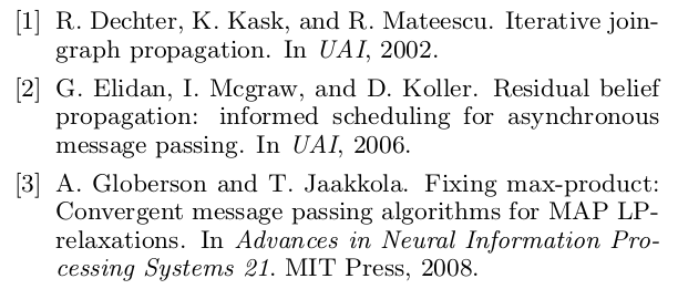
For these, I had to do something a little janky. I use pdftotext to turn the paper PDF to a text file. This is harder than the one above, because while .bbl files are in a pretty standard format, different paper styles render their references in somewhat different ways. Here are just a couple examples:


So I have to get the titles from these. It’s the type of thing that’s trivial to describe or do in a single case, but probably hard to do in general. Maybe you can do some clever filtering to figure out what the title is, but it was easier just to figure out the few formats that are used on arXiv, figure out which format a given reference is in, and then parse it.
d3.js interactive graph
So far this was mostly about fetching, parsing, and plotting using networkx. However, once you have the graph information, it’s pretty easy to convert it to an interactive graph using d3.js! I’ve previously used d3.js for a few projects. It takes some investment to learn, but once you get the hang of it you can do some cool stuff.
In this case, I hacked the graph together the d3.js nodes/network presentation from a few sources I found from searching (that I can’t for the life of me find now). d3.js is actually intended to handle data in JSON format, so it’s pretty straightforward to go from what I already have to that. I just iterate through the nodes and edges and create a dict of nodes and their properties, and edges/links and their corresponding source/targets. Note that even though the graph is being displayed with d3 here, the actual positions of the nodes were determined using networkx as described above (d3.js can do these things too, but I already had it in a layout I liked with networkx).
I added a few features that you can only have with an interactive graph. If you hover over the node, it shows you the title and year. If the paper is an arXiv paper, it appears with the link to it. Additionally, since it’s usually pretty cluttered, I made it so everything is a little grayed out, and when you hover over a node, it highlights its references, what references it, and the links between them. If you click on a node, it focuses it, so you can click the link.
But what am I doing telling you about it when you can just try it here!
Note that you can also drag around and zoom in and out.
Well, that’s about all for now. There are a few things I’d like to improve on or update if I ever come back to this (or if you’d like to, please do a pull request!):
- Non-arXiv papers
- Make node size dependent on how many ones reference it
- Better parsing (maybe its own project? Could be hefty)
- Polish up the d3.js (it’s a little clunky right now)
The repo for this can be found here.